SNOTROCKET
GAME UI / UX
UI/UX Design | HUD | Menus | Interaction Design | Visual language | Implementation

SNOTROCKET
PROJECT SUMMARY
Duration
4 months
Team
13 full time, additional freelance & partners
Release
April 2026 → PC
Friendslop Contagion
My Role(s)
UX Director
UI Designer & Programmer
Additional Game Design
Additional Art Direction
Tools
Figma
Unreal Engine 5
Krita
DaVinci Resolve
Diversion
SNOTROCKET
TRAILER
30 SECONDS OF UI
If you’re short on time, here’s a few screens as they were for the early access launch.
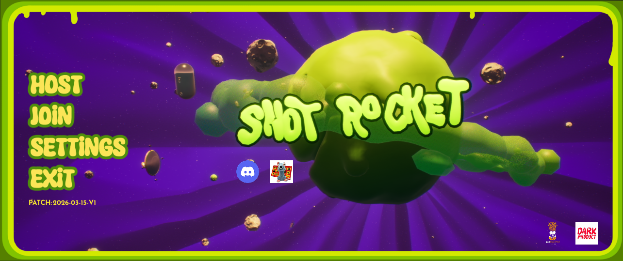
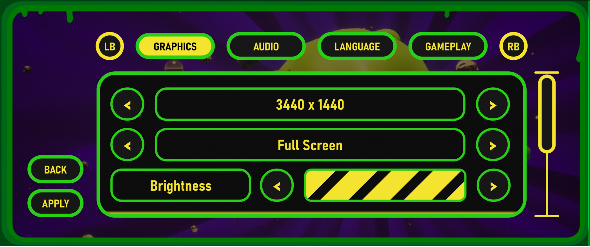
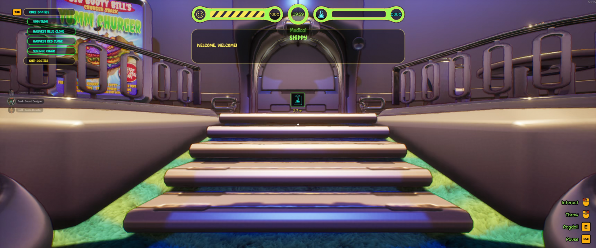
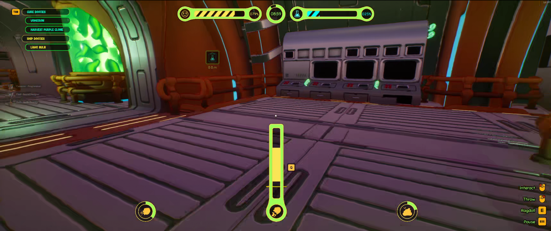
SNOTROCKET
UX / UI GOALS
“At a glance” philosphy. With SNOTROCKET being a friendslop game, I didn’t want the player to have to open many separate menus to access different information. I wanted it all on screen, so they don’t have to remember anything, if they are just jumping in with friends and thus inevitable skipping any onboarding to get in game faster. The difficulty was still keeping it readable instead of cluttered.
I wanted SNOTROCKET to be really easy to jump into and since our target group was 6-16 year olds, I also wanted it to be easy to play with limited reading skills. As a result, I wanted to keep the UI and user flows very simple.
With SNOTROCKET being aimed at 6-16 year olds, I expected to have to accommodate parents and grand parents too. The huge age span of potential players and extremely different levels of developed motor control or reading ability led to me making accessibility a big focus. I also knew, that a game like SNOTROCKET would inevitably land on handhelds, if it was successful. So accessibility features would double as future-proofing for when we ported to smaller screens or players opted to play it on the Steamdeck.
The previous three goals made a very strict visual hierarchy important and a good starting point for building towards fulfilling all four.
Like hierarchy, consistency is key for accomplishing goals one to three.